SkinBox
/ UX Design
/ User Research
/ Website UI Design
/ Web Development
/ Ecommerce
/ Branding

The Project

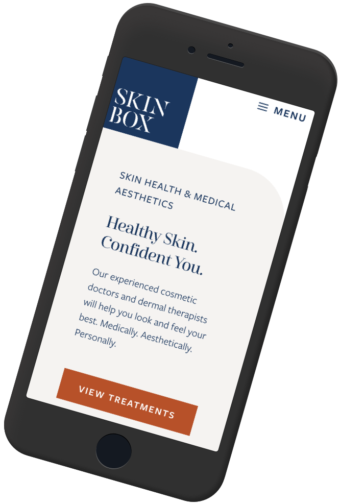
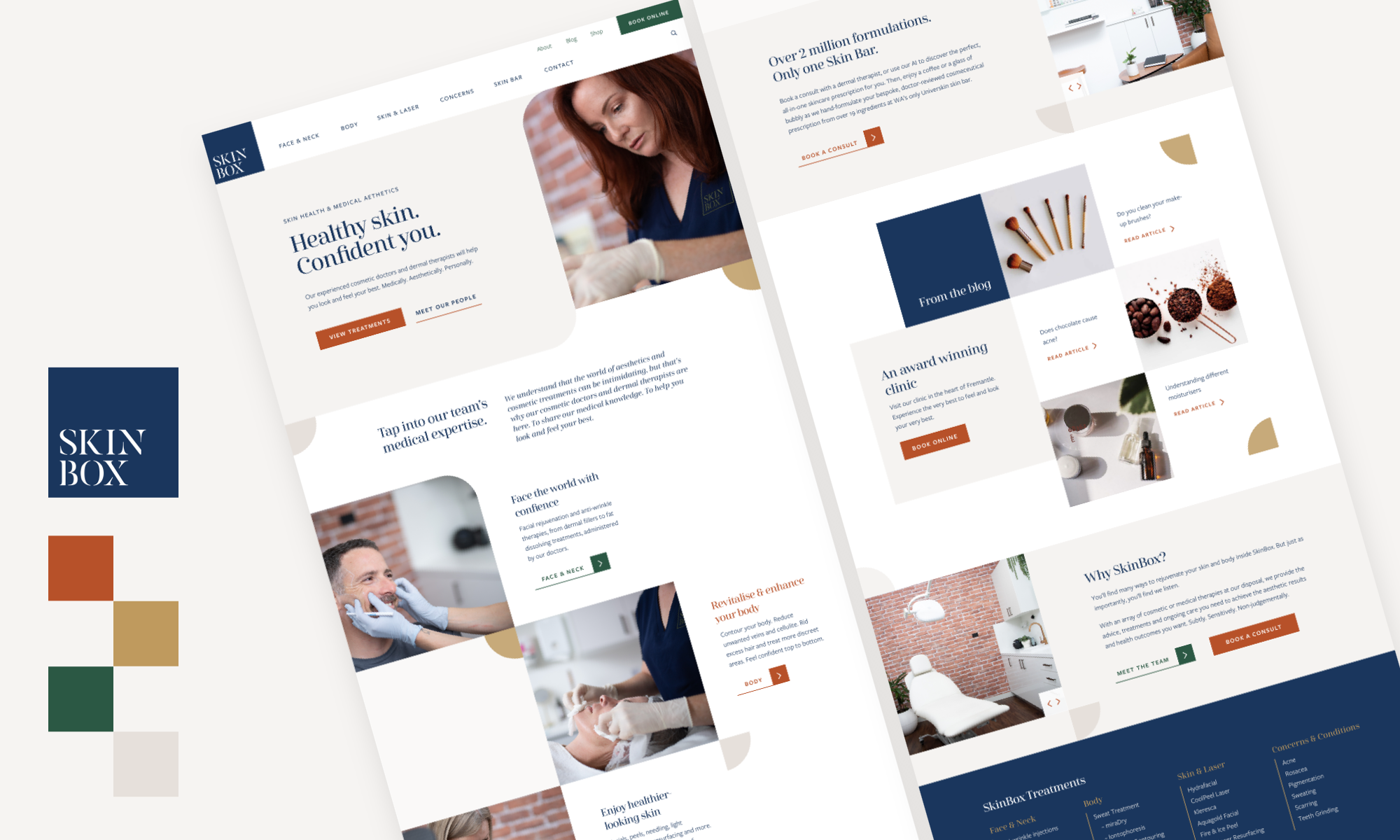
We delivered a new brand and custom, content rich website. The culmination of user research, definition and discovery.
SkinBox was derived from the need to separate an existing business (The Skin Clinic Fremantle), which was serving two different markets: Skin cancer patients and cosmetic patients.
As their treatment offering continued to grow, The Skin Clinic realised the need to separate into two entities, enabling then to better meet the needs of two different patient personas, both online and at the Clinic.
Given the success and size of The Skin Clinic website, we had a good place to start. We ran exit-intent questionnaires on the site to learn about the user experience, and followed up with card-sorting exercises to determine the naming convention and order of the navigation and hierarchy (IA).
We worked with the SkinBox to define their personality, which was further represented through the Clinic’s recent fit-out. They are honest, individualised and educational. They created a welcoming, warm space where patients can feel relaxed and are listened to. We were tasked with creating a digital presence that reflected that.
After creating the logo, a style guide was developed to help the SkinBox team ensure brand consistency going forwards.
The look and feel of the website was determined by the need to extend the physical space and experience into their digital presence. With a nod to the art-deco style, a warm and natural colour palette opens the way for the content, which is primary to the site, designed to educate and empower.


