Designers can be curious souls. Likely to be introverts, full of empathy and great at problem-solving. Also likely to be happy working away in solitude. This can be a problem, because tempting as it can be to exclude stakeholders from the design process, there are huge advantages to purposefully including them in it.
Inclusive design starts when the project does.
Realising this has enabled me to deliver digital products and projects with less frustration on both sides and a better, more productive and enjoyable experience for me and for my clients.
Why should stakeholders be part of the design process?
Before we go further, let me just clarify: I’m not talking about sending a mid-to-late stage website design mockup around the office so everyone can ‘have their say’ whilst discussing (arguing the toss over) which color the primary button should be or whether the logo is big enough (it is, by the way).
Nor am I talking about asking whether stakeholders ‘like’ or ‘approve’ a mocked-up design.
I’m talking about the design ‘process’. And why it’s incredibly beneficial to get key stakeholders involved early-on.
The Big Reveal is a bad idea.
For User Interface (UI) and User Experience (UX) Designers like myself, it’s easy to fall into the trap of secretive design, by which we beaver away in blessed solitude- working towards The Big Reveal.
The Big Reveal is often as scary for the designer as it is for their client. You never quite know what the reaction will be when you drop your carefully curated design in front of someone for the first time.
From experience, not everyones appreciates surprises, and rightly so. More often than not, they don’t align with our expectations. So, how can we work together to eliminate that confronting moment, but still get design feedback and approval?
The solution: Co-design.
I’ve sat on many, many video calls titled Codesign sessions, which have really been long-winded and frustrating meetings. At best, you might call them a ‘Discovery Session’ or ‘Feature Clarification Call’.
Codesign isn’t research or discovery (though both can be a by-product), more the culmination of both, presented and/or explored via visual means.
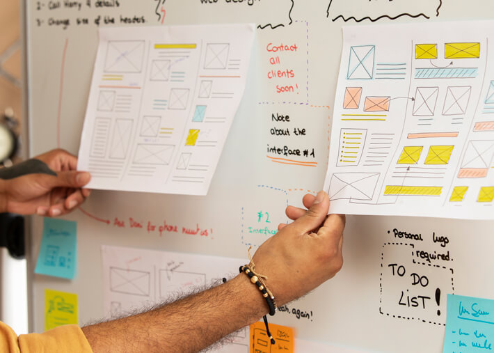
Often times, the visual aspect of CoDesign starts around the Wireframe phase, so this article will explain how to deliver a Wireframe Workshop.
In the context of website design or product design, a wireframe is a basic visual representation of what’s going to go where on a screen layout.
Wireframes help us to allocate space for each piece of content, and to establish a content hierarchy.
The result is a somewhat simplified interface that succinctly demonstrates a page’s proposed structure and layout. A wireframe might also include some loose ideas around copy – and anything else that will help us to conceptualise our proposed solutions.
As the blueprint of your future site or product, low-fidelity wireframes don’t have to be created by User Interface (UI) Designers. Aesthetics really aren’t important at this stage of the process.
In fact, we want to take attention away from the visual design, so it doesn’t steal the limelight. We want to keep everyone’s focus on the underlying structure of our interface.
A wireframe can be sketched on paper, on a whiteboard, made using online design software or via a specific wire-framing tool, like Whimsical or Balsamic.
They are just one of the many fabulous tools we Designers have at our disposal when it comes to co-creating websites and co-designing products with multiple stakeholders.

So, how can you co-design a wireframe?
Wireframe Workshops
Done right, a Wireframe Workshop can produce a strong foundation for the visual design phase of your project. The benefits are many:
- Stakeholders feel involved from the get-go
- Stakeholders on both sides are educated as to what the challenges are and what limitations and restrictions might exist
- Everyone reaches a consensus as to what the priorities are
- Any flaws in your intended plan, like missing content or features, are surfaced and addressed long before the prototype and interface design phase
- Costly mistakes are avoided, minimising the chance of delays and scope/budget creep once development is underway
What’s the end-goal of a Wireframe Workshop?
We’re hoping to complete the workshop with a solid understanding of how key pages should flow, function, and behave.
At the end of it, you’ll want a strong level of confidence in that the selected wireframes will not need any major changes before final approval, so it is critical that everyone on both teams (agency and client) can develop and view these ideas together.
How you approach a wireframe workshop will be somewhat dependent on the project, however here are a couple of short exercises that would apply in most scenarios.
How to conduct a Wireframe Workshop
If you don’t already have your initial discovery and user research in the bag, it’s too early for a Wireframe Workshop.
Your initial discovery and research will ensure you can remind participants what the organisational requirements are, who the users are and what they need.
Keeping focus on what’s important will prevent well-meaning individuals from pushing their own department and/or agenda.
Who’s in the room?
As with most workshops, getting the right people in the room is key. Who you invite will depend on your organisation, but you’ll want to include key stakeholders from both sides of the project. This might include:
- UX Designers (Obvs)
- UI Designers
- Developers
- Project Managers
- Content Authors/Editors
- Marketing Managers
- IT Staff
- Customer Support Staff
- Anyone else who is involved in delivering or signing off on the project, like higher-ups, board members, CEO’s etc
And bonus points if you can get some end-users in the room too! CEO’s almost never hear from their customers, so this kind of feedback is absolute gold, both for your project and the organisation you’re working with.

Image by peoplecreations on Freepik
Exercises you can use to help stakeholders co-create wireframes
Exercise 1: Educate about Cognitive Load – User Attention Exercise
This exercise helps stakeholders to understand some of the limitations that designers work with and provides insights as to how they can be overcome.
You can learn more about Cognitive Load here, but in short, we want to minimise the effort it takes our users to carry out tasks.
1 \ Decide on groups vs group
Seperate your stakeholders into small groups, or if you only have a few attendees, work as one group with a whiteboard.
2 \ List all the site elements
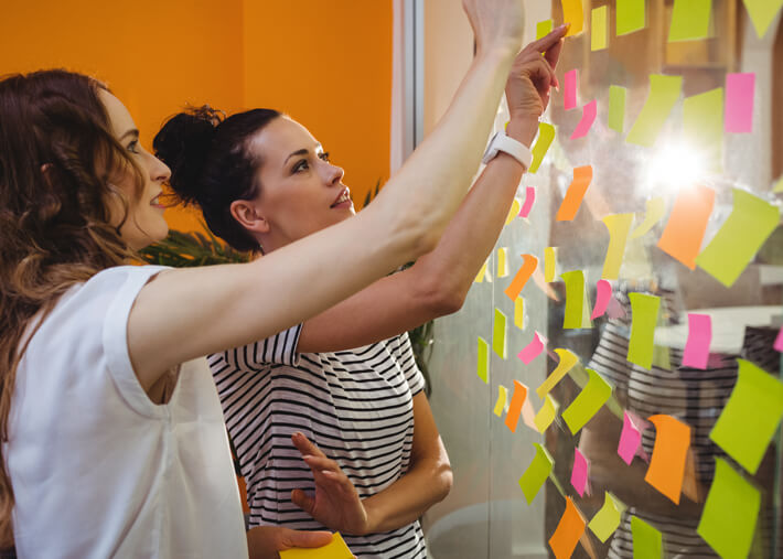
Ask each group (or person) to collate a list of elements that need to go on the home page of their website, writing each element on a seperate post-it note.
This would include things like logo, navigation, blog posts, list of services, search bar, products, privacy policy etc.
You can make it into a competition to see which group/person can come up with the most, so that everyone is encouraged to have their say.
3 \ Collate the results
Add the post-it’s to a whiteboard, grouping any duplicates. Typically, this results in a lot of post-it notes. Each stakeholder will have a different agenda, and different ideas about what should go on the home page, so you may want to communicate that issue (gently) at this point.
4 \ Conduct a vote
Next, give each Stakeholder 16 sticky dots. Each dot represents a vote for attention.
Attention votes can be ‘spent’ against the post-its (website elements) and the stakeholders must spend their votes on the elements they feel are most important.
So they might allocate 1 to the logo, 2 to the navigation, 4 to their hero banner and so on.
5 \ Listen carefully
Encourage your participants to discuss how to best allocate their points. This will dictate where they think user attention is best ‘spent’, and you can gather some great insights from the conversations that happen during this process.
The typical outcome is that most participants will still spread their points around, as they struggle to decide which elements are most important.
6 \ Reveal the problem
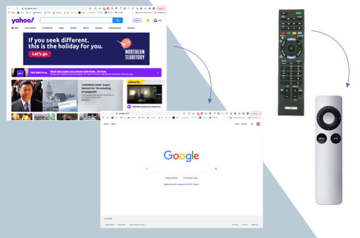
Now’s the time to show them the problem with their approach. Once everyone has spent their votes, show them screenshots of Yahoo and Google side by side.

Explain that Google spent almost all their points on the search box. You can discuss which page is better/most successful – the consensus is always Google, because it’s less cluttered and easier to understand.
With all the elements on their home page, our participants just created ‘Yahoo’, when what we really want to create is ‘Google’.
This is where the penny drops and stakeholders start to understand a little about cognitive load. If your website tries to be everything to everyone all at once, it will overwhelm and frustrate your users.
7 \ Iterate
You can carry out the exercise a second time, asking users to ‘spend’ their points again. The outcome requires some tough decision making, but the result leads to better prioritisation and less excess/redundant fluff.
Exercise 2: Experiment on paper – Crazy 8’s
Also known as 6-up, this is an exercise often used in Design Sprints to get fast ideas on paper. Here’s how:
1 \
Take a sheet of paper and fold it in half three times. When you open it out, you’ll have 8 ‘boxes’.
2 \
Each person (or group if you have a large number of participants), is asked to draw a wireframe for a page of the site. You can show some examples first so that the uninitiated get a better understanding of what a wireframes looks like.
3 \
After the first couple of iterations, people usually start to struggle for new ideas. You can make some suggestions here, like how they might change a page for a specific audience for example.
The goal is to encourage ideation iteration, by which we show that there are many points of view, and different strokes for different folks. Sometimes you’ll get an idea you may not have considered too!
These two exercises can be carried out over a single session, and you should be able to keep it under 90 minutes.
By offering stakeholders insights as to what challenges we might face as designers, not to mention the many other factors can influence design decisions, we can build strong rapport and elicit trust in our process.
Co-designing via a Wireframe Workshop will educate stakeholders, help them have their say and result in less push back when it’s time for approvals. It’s also going to result in less back and forth explaining each and every design decision (assuming you had the right people in the room!)
What next?
These sessions can provide designers with some great organisational insights via the conversations that happen in the room throughout the process.
The next step is on the designer, who’s tasked with extracting key take-aways, merging them with any research and discovery already complete, and creating a set of wireframes which can be easily transformed into a clickable prototype for testing.
Humans are unpredictable at best, but from my experience, co-design helps to eliminate many of the blockers that can derail and delay a project in the later stages. Should stakeholders be part of the deign process? Absolutely.
~ Sarah Jee

