In a world where information overload is a real problem, how can your organisation cut through? How can we help people learn about what you have to offer without adding to an already overwhelming amount of information?
We all have those days where our brain feels so full we can’t seem to function properly. Sometimes you just forget something, other times the repercussions are more serious.
Putting this in the context of your website or digital product, the amount of mental effort needed to decipher the interface you present your users with, is relative to the level of cognitive load they will experience.
What is cognitive load?
Cognitive load is basically the amount of work we give our brain when we’re thinking, making decisions. The higher the cognitive load, (the more things we’re thinking, the more complex those thoughts), the more effort and energy we need to process.
Think of it like your mobile phone. We know leaving all our apps running at once will drain the battery and/or make the apps slower to respond, so we close them down when we’re not really using them. This reduces the amount of processing power needed and improves overall performance.
Same goes for your brain. It has a set amount of working memory, and attempting to process too many, sometimes complex things at once will essentially cause it to malfunction or crash!
See if you’re affected by cognitive load.
To demonstrate: Watch the video below and count the number of times players in white pass the ball.
If you missed the gorilla, (or the curtain change, or the player walking off stage), you experienced cognitive load.
How does cognitive load affect my website or digital product?
Well, if you just missed a hairy gorilla because you weren’t looking for him, how can you be sure your users are seeing prominent elements (like phone numbers, contact buttons and so on) or important, informative content on your website?
Keeping a users cognitive load to a minimum, is an essential part of the UX design process.
Presenting content that is self-explanatory, obvious and easily consumed is an absolute necessity if we are to help our users find information, make informed decisions and complete online tasks.
Don’t make me think!
~ Steve Krug
As a UX designer, I often find that my first role in any project is to simplify:
- simplify what the organisation or business has to offer,
- simplify how we communicate that through words and design,
- simplify the amount of effort required to allow our users to do business with us, learn what we’re teaching or just complete the task they came to carry out.
This simplification brings about clarity, helping us to decide what’s most important, so we, in turn, can help our users focus on the right thing at the right time, reducing overwhelm and improving their overall experience.
Ways to reduce cognitive load on your website and in digital products:
If you’re already considering ways to improve the digital experiences you provide to your users, you’re probably already dealing with some of the causes of cognitive load. Implementing good website usability, inclusive design and accessibility standards can naturally reduce the thought process for your clients and customers.
Here are four ways you can reduce cognitive load on your digital platforms:
1. Account for your users mental model
There’s a reason the majority of websites have a navigation menu and logo at the top, and a footer area of links at the bottom. It’s because that’s where the majority of users have come to expect to find them. (I’ll save the argument about whether this is killing creativity for another day..)
When you stick to design conventions that your users have encountered elsewhere, you’ll save them the mental energy needed to process your ‘cutting edge’ layout. The smaller the learning curve, the lighter the cognitive load.
Needless to say, this is worth noting if you’re thinking about a website redesign. Familiarity allows your users to focus on the task they came to complete, without needing to learn something new first.
Users spend most of their time on other sites, and they prefer your site to work the same way as all the other sites that they already know.
~ Jakob’s Law
As humans, we’re generally not that excited about change.
When you rush into the supermarket to pick up the missing ingredient you need for dinner, it’s annoying to discover that they moved it to a new spot which takes you longer to find. Then you get to checkout, and they installed new self-checkout that works differently to the old ones. It’s frustrating right? You just wanted to buy the damn chocolate cake!
Same goes for your website. If your site has returning visitors who roll up one day to complete a task only to find they need to learn a new way of doing that – it’s really frustrating. The learning curve increases cognitive load, increases frustration, so we need to tread carefully when redesigning our websites and digital products.
In short, if you’re going to make big changes, they have to be very very intuitive.
Related article: Customer Journey Maps – The what, why, when and how
2. Keep your content concise
Writing content for the web is different to writing a white paper or other formal or technical documents. The way we consume online content is different.
When we land on a website, we scan through the page to see if we’re in the right place. We’re looking to see if the content gives us the information we’re seeking, answers a question, or solves our problem. Sometimes we scan just to see if it’s interesting enough for us to spend our time reading it.
All too often, I’m handed content that is long-winded, trying to be cute/clever, full of internal and/or industry jargon or just plain confusing. To make matters worse, it’s often justified as a ‘legal requirement’ or ‘company policy’. (Neither are a valid excuse in my book).
If you want people to do business with you, buy your thing, donate to your cause or consume your content, you have to make an effort to write accessible, easy-to-read content and deliver it in a simple and unambiguous way.
Online content should:
- be succinct, unambiguous and to the point,
- not use jargon or words that only make sense internally,
- make use of headings, bullet points, logical structures,
- be ‘chunked’ into sections to help the reader navigate and scan.
Further reading:
How do you know what to write about on your website?
Writing Website Content – Where Do I Start?
3. Reduce the number of choices when possible
Did you ever go to buy a pair of shoes, find the perfect fit and then leave them in the store because they came in five colours and you couldn’t decide which you wanted? Ok, maybe this is just the shoe-addicts amongst us but this experience is classic analysis paralysis. It’s an example of Hicks Law.
The time it takes to make a decision increases with the number and complexity of choices.
~ Hicks Law
Too much choice causes high cognitive load. By providing the right information at the right time, we can help our users find the most direct route to where they want to go.
You can apply this to actual tasks too. By breaking complex tasks into smaller chunks, we can make it easier for people to complete them. For example, splitting a long form over several pages (indicating progress as the form is completed), is less overwhelming than being faced with a seemingly endless request for information.
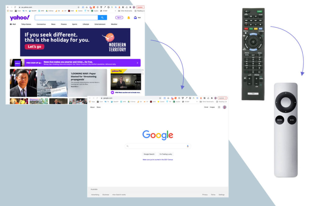
4. Minimise visual clutter
Following on the above point, less clutter = lower cognitive load.
There’s a reason Apple removed almost all the buttons from their remote control, it’s the same reason Google’s home page looks so different to Yahoo’s. By reducing clutter, we’re helping people to focus on fewer things at any given time.
As a minimalist designer, when I’m close to completing a website mockup or product prototype, instead of asking what’s missing, I try to ask myself, “What can I take away?” I’m as guilty as the next user interface designer – we can all get carried away making something pretty, but it pays to check ourselves.
If design elements exist because they help to convey the message, strengthen the brand or provide intuitive visual indicators as to what to do next, great! Otherwise, do we really need to include them? If you can’t articulate a design decision, it’s probably just fluff that you can do without!
Understanding what your user needs to see when, and what task/s they are trying to complete, will help you create a more streamlined, effective content hierarchy and information architecture. Both are necessary when seeking to reduce cognitive load.
Further reading:
Customer Journey Maps – The what, why, when and how
How to do a card sorting exercise
Minimise cognitive load to maximise user experience.
Whether simplifying the complex, or just making more considered design choices, there’s no doubt that reducing cognitive load will help your customers and clients. No one likes to feel confused or frustrated and truth be told, it’s not that hard to be a little bit more helpful..