It’s estimated that 1 in 5 Australians have a disability, so by not considering accessibility measures on your website / in digital products, you could be missing out on 20% of your potential customer base.
Are you one of the many organisations discriminating against disabled people without even realising?
Accessibility is the concept of whether a product or service can be used by everyone—however they encounter it.
– Interaction Design Foundation
The business case for accessibility.
Accessible and inclusive design principles improve the overall user experience for everyone, not just those with a disability. In addition to tapping into a market that you may be missing, improving website accessibility could see you benefit from higher customer satisfaction overall. Providing all users with the same experience is an essential component of any digital strategy.
Disabilities that could affect how difficult it is for people to use your digital platforms include:
- deafness
- neurological issues
- full or partial blindness
- difficulty speaking
- motor skills
- learning difficulties
Aside from supporting users who are registered as disabled, accessible websites and digital products can also help:
- anyone with a temporary disability – maybe someone who has broken their wrist or lost their reading glasses
- people whose experience is location dependent, i.e they might be outdoors and dealing with light glare, or on public transport where they can’t watch/listen to a video or audio recording.
- users subject to a poor internet connection or those with bandwidth limitations (more common than you might think, even right here in Australia).
- older people (that’s around 19% of the Australian population), many of whom have come to depend on digital to help them maintain their independence.
Further reading: Designing websites for older people
Further Reading The business case for digital accessibility
There are no disabled people, we are all just temporarily abled.
Henry Viscardi Jr, Disability rights advocate.
It is actually against the law to discriminate against a person with a disability, whether you realise you’re doing it or not. At time of writing, web accessibility guidelines are just that, a set of guiding principles that you may choose to implement or not. However, digital accessibility is an area that is becoming more regulated, and rightly so, with a handful of cases resulting in lawsuits, which are also steadily on the rise.
Meeting your digital accessibility obligations would help you side-step any potential legal issues and make sure you’re not missing out on market share. Providing fully accessible digital platforms could add to your bottom line, helping you to reach more people regardless of their status or situation.
More than that, it’s about doing the right thing.
Read more about your obligations under the Disability Discrimination Act:
- Disability Discrimination Act 1992
- World Wide Web Access: Disability Discrimination Act Advisory Notes ver 4.1 (2014)
How can you make your website accessible?
In an ideal world, this is a question to ask at the start of a digital project, be that a new website, website redesign or other digital platform. Of course we rarely find ourselves living in an ideal world, but that doesn’t mean we should wait until a new project comes along before we seek to make our digital assets accessible. The good news is, changes you make to improve the accessibility of your website can have a positive knock-on effect for your business – improved user experience. Both offer a positive ROI.
Website accessibility can be hard to implement, but not as hard as you might think.
I’m the first to admit, it sounds a bit scary. The website accessibility guidelines are long and intricate and if you’re not across the technical terms they can be somewhat overwhelming.
The good news is, making your website accessible isn’t as difficult as you might think. With that in mind, here are 5 practical things you can check to improve website accessibility.
Practical Website Accessibility – 5 easy fixes
Note: This isn’t a comprehensive list, rather a guiding set of principles – quick wins for non-developers – that will help you to get a few steps closer to delivering an inclusive online experience.
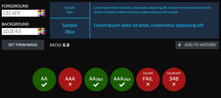
1. Use strong color contrast
A beautiful looking website isn’t necessarily a practical one. As a minimalist designer myself, I understand how easy (and tempting) it is to put form over function, but as designers, product owners and stakeholders, we must go to great lengths to make great design choices that are accessible to all, otherwise, we are doing a disservice to both our clients and their customers.
Sufficient color contrast is essential if you want all your users to be able to interact with your digital products.
With shiny, high resolution retina displays being the first choice for many designers, it’s easy to forget that not everyone has the same luxury.
Your website redesign might ‘pop’ on your perfect display, but what device is your customer using? Even if they have the latest iPad Pro, is it possible they might be viewing your website outdoors where light reflection is an issue? What about the people with deteriorating eyesight (a.k.a everyone over 40), or those living with colour-blindness (1 in 12 men).
This really is one of the easiest changes you can implement to improve your websites accessibility.
How to ensure you have sufficient color contrast:
If you’re working to a Style Guide created by a branding specialist, you’ll need to get together and agree on an additional set of colours that are suitable for digital. Where no style guide has been created, decide on the level of accessibility you are aiming to meet and define an accessible color palette.
There are no end of tools available to help you meet minimum color contrast requirements. My favourite is contrastchecker.com I usually aim for a minimum ‘AA’ rating using this tool.
Note: Web Content Accessibility Guidelines (WCAG) have three levels of conformance, with ‘A’ being the lowest and ‘AAA’ being the highest. My advice is to start at the start (profound I know) – once you attain an ‘A’ rating you can implement gradual improvements over time.
2. Ensure images are accessible
When you add images to your website, the browser (safari, chrome etc) will know it’s an image, google will know it’s an image, and people using a screen reader will know it’s an image. However, unless we explain what that image is, that’s pretty much all they will know. (They won’t know what the content of the image is).
In addition, if your user has a slow internet connection, or limited data, they may have chosen to not load images when they look at websites, so it’s a problem if you’re relying on an image to deliver content.
This is not good, but the fix is really easy.
How to ensure your images can be ‘seen’ by people and search engines:
Alt Text ‘alternative text’ is all you need. Adding Alt Text to images adds to the markup of your website. Most websites will allow you to add an alt text when you upload your image, so it’s super-easy to keep this one in check.
Your Alt Text needs to describe what the image is, succinctly (within 125 characters is best). This description is what search engines will ‘see’, what screen readers will communicate, and what browsers will display in situations where your images are missing. This one improves accessibility but is also great for Search Engine Optimisation (SEO).
Further reading:
Moz – Alt text for SEO
Web AIM – Alt text for accessibility
3. Avoid using images with text overlay.
This one is self-explanatory now you understand about Alt Text. If search engines and screen readers cannot see the content of an image, then they certainly can’t read text within images either.
In addition, the true text on your website can be resized by the user, allowing them to zoom in until it’s large enough for them to read comfortably. This doesn’t translate to text in images so well. Text in images cannot be copied/pasted, which is frustrating for everyone, not just those with accessibility requirements.
How to avoid losing text in images:
Well, don’t put text in graphics. Easy! If you absolutely have to use a graphic that contains text (e.g an illustration), be sure to write descriptive Alt Text as explained in the previous point. If you must add text over an image, at least make sure the text part appears in the markup, so it can be seen by search engines and can be copied and pasted.
Further reading: Why Is It Important for Accessibility to Use Actual Text Instead of Images of Text?
4. Add written transcripts to audio and video content
If someone has full or partial deafness, watching video content can be frustrating for obvious reasons. This also applies to someone on the train who left their headphones in the office!
How to transcribe video and audio for better website accessibility:
To gain an ‘A’ rating, providing a written transcript alongside the video/audio will suffice. At a basic level, you can do this yourself by simply providing a written transcription as text content. You can also make use of the many online tools that will do this for you, with varying levels of output. Check out Otter, or Trint, which will also provide the transcript in different languages!
5. Think about your links
So many websites I visit have links or buttons that say ‘find out more’, ‘click here’ or ‘view’. If your website is being accessed by someone using a screen reader, it’s likely that the link text is all it will read, in which case, the link text provides zero insight as to what they will find if they follow that link.
Another link issue is not making it clear what is and isn’t an actual link. An obvious visual indicator should tell us what’s clickable and what’s not.
How to provide useful links:
In short, context is all you need. Make your link text make sense, if the other things on the page didn’t exist. Replace generic link text like ‘click here’ with more descriptive link text, like ‘Learn about our consulting services’ for example.
Make sure you use more than color alone to identify a link. Someone who is partially sighted or color-blind won’t be able to spot that easily. An underline is the most commonly recognised link indicator.
Want to improve your website accessibility more?
As a website owner or manager, if you’ve worked through the above issues you have made a great start, so well done you. If you want to go further (and we all should), the good news is there are some awesome tools to help you.
Tools to check for website accessibility issues:
WAVE Web Accessibility Evaluation Tool
SiteImprove
Monsido
Website accessibility is never ‘finished’.
Much like SEO, page speed, conversion optimisation and user experience, website accessibility is an ongoing process that needs to be considered as an integral part of your digital strategy.
All too often, accessibility becomes something we mark off our to-list and never think about again. It’s not unusual for an organisation to create a fully accessible website, only for it to fall from grace as soon as someone uploads an image with a missing Alt Tag, or adds a video without a transcription.
So education is key. The people put in place to maintain your website should be across the basics, so they can maintain the integrity of your website as it evolves and grows.
Website accessibility is something that every organisation can benefit from, ethically and financially, so you really have nothing to lose!
Pingback: Creating websites for older people | Get With The Brand
Pingback: Cognitive load: How do you avoid information overload on your website? | Get With The Brand
Pingback: All About Alt-Text - Get With The Brand
Pingback: You just launched your website, now what? - Get With The Brand