Be it the words on the page or visual elements, content is still king. In this article, we will help you reconsider the visual elements needed for your website to be a success.
Without exception, content is almost always the thing that halts progress on a website redesign project.
Poorly written content, low quality and/or unsuitable images can make or break your website redesign project and have a huge impact on the return on your investment.
Imagery is more than just photographs. It can also include branding elements, illustration, icons sets and video content. This article will focus on website photography.
As you may already know, you only have a matter of seconds to convince your website visitors they are in the right place before they hit the back button. There is no better way to prevent them leaving than combining a short, succinct Unique Value Proposition with powerful, high-quality imagery that realistically represents how life will look when you solve the problem they came looking for help with.
We’re all familiar with the phrase “A picture says a thousand words”. There’s a reason for that. It’s true!
Website photography guidelines and best practices
Where possible, get your own.
I’m not saying there is never a place for stock photography, but I will say that in most cases, using stock imagery is a missed opportunity. Rarely will you find stock images that are a unique, on-point and personal representation of your organisation, product or service.
More importantly, how can you expect to show empathy in a way that will resonate with your target market if you are displaying images that were not created specifically, with your users in mind? The photographs on your website should trigger emotion in your visitors.
Think quality over quantity.
A well-planned photoshoot resulting in a dozen high-quality, emotive and relevant images, will always be more beneficial than 50 sub-standard stock images. Do your research. Find a photographer that has experience shooting for websites. Look at their portfolio and ask for examples of websites that use their images to sell a product or service. Do the images support the product/service you’re selling? Do they show how buying the thing could make someone’s life better? Would you be tempted to buy? All these things are possible with the right imagery, so it is well worth that extra effort.
If your website is poorly designed, it will reflect badly on your organisation. Blurry, fuzzy, badly shot images will likley do more harm that good.
TIP: Ask your photographer to shoot wide images that your website designer can crop themselves. This will allow your designer more flexibility when it comes to displaying your images effectively on multiple devices and screen sizes.
Choose images that support your content.
Your website photography should be meaningful. It should back-up/reinforce your written content and stir emotions that support your overall message. An image that conveys the wrong message is confusing, maybe even misleading. Context is everything – so ideally, every image on your site should connect to your product/service.
Keep it real. Be human.
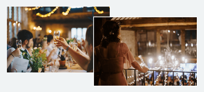
Humans, for the most part, like humans. Using photography of real people on your website will help your users connect with your organization. It will support the feeling that they are dealing with people, in an emotional transaction, not just a financial one. Avoid overly staged shots: realistic representations are (not-surprisingly) far more believable. Think about how people interact with your product or service, what does that look like? Be authentic. Don’t be afraid to show your organisation’s personality.
TIP: When using people in photography, think about eye-tracking. When we look at a photo with a person in it, we are automatically drawn to the eyes. We then follow the line of sight, so a photo of a person looking in the direction of your unique value proposition, demo or call to action, is a great way to draw attention to those things and potentially increase the conversion rate.
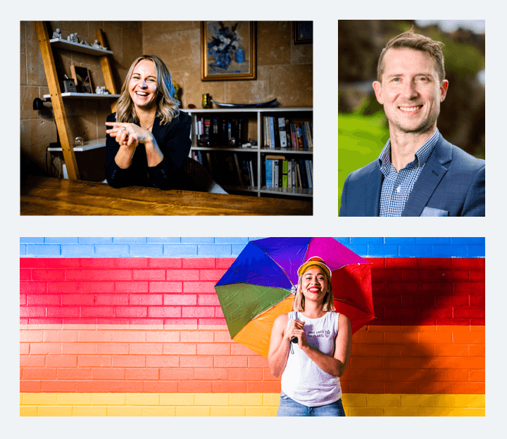
A sidenote on corporate headshots.
I fully understand that a lot of people don’t want to be on camera (I’m one of them so really, I get it), but today more than ever, people want to know who they’re doing business with. About pages are often one of the most visited pages on a website. Potential clients are keen to know about you, who you are, who you work with, what your opinion is, whether you’re an ethical company. Why? We all crave human connection, even the introverts, and we all want to be able to the trust the person or organisation that we’re about to give our money to.
Point I’m making is that your mugshot is important. Don’t send me your latest facebook profile pic or something that was taken at your friends wedding. Think about what you want it to say about you. Get it done right. Much like the images above ( -different photos elicit different emotions- ), your headshot can really help you tell and sell. It doesn’t have to be a stuffy corporate shot either (even if your market is corporate). Check out the profile photos below.
All friendly, all clear, all eliciting a different vibe with different levels of personality.
Try to be impartial, unbiased.
Your website isn’t for you. It’s for your users, your potential customers.
Avoid choosing images that you simply ‘like’. Instead, be mindful of your user – it will pay off! What will appeal to your target market? Be careful to not make too many assumptions here. If you’re not sure. Ask them! Get your images in front of real users to see which resonates with them. You may not know them as well as you think you do.
In short..
Skimping on content is false economy. Get this right, and you will undoubtedly see much higher return on your investment. A lot of work goes into building a website, both for you and the people that you hire to design and build it. If the content isn’t up to mustard, the job gets harder for everyone involved. (Don’t be that guy..)
Ready to start a new website design or time to revisit and revamp your existing website? Talk to Sarah.
Pingback: All About Alt-Text - Get With The Brand